Open Snow
Your trusted source for the most accurate weather forecast and snow report

Client
Type
Role
(Team: Brain,Evan, Jess)
Year
The Overview
Redesign existing app experience for 1M+ users to double Open Snow revenue within 6 months
Why did the client want a redesign?
OpenSnow came to us with a successful app that had powerful forecasting features, but they were facing critical business challenges: low feature adoption among their 1M+ users, high support costs from confused users, and retention issues as weekend warriors found the interface too complex while experts bypassed the app entirely. Despite having incredibly valuable data-rich tools, their interface was preventing users from accessing the features they needed.
What We Found Through User Research:
Pain Points:
70% of users only used basic features
High support tickets for "How do I...?" questions
Expert users bypassing app for external tools
Low feature adoption despite rich functionality
Key Insight: Users want complex data but need guidance to discover it
User Types Identified:
Weekend Warriors: Quick decisions, simple needs
Backcountry Experts: Detailed data, safety-critical decision
The Core Problems
Lack of understanding of complex features
Low user confidence in app navigation
Limited feature discovery paths
Inadequate support for feature knowledge
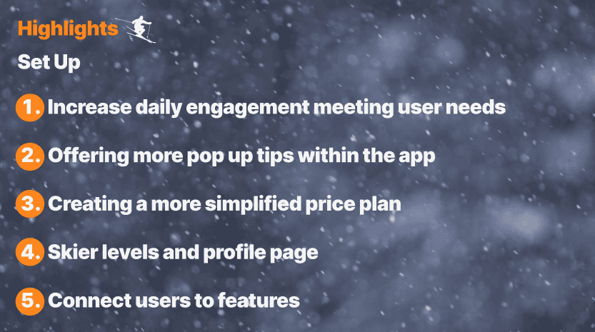
Project Goals
Feature discoverability - Address hidden valuable features
Support burden reduction - Target operational efficiency
Expertise gap bridging - Solve the dual user base challenge
Scalable framework - Ensure long-term design system success
Design Process - Iteration 1
V1: Baseline Assessment
Mapped current user journeys
Identified drop-off points
Analyzed support ticket patterns
Discovery: Features existed but were buried in navigation
Design Process - Iteration 2
V2: AI-Powered Approach
Explored automated recommendations
Smart defaults and personalization
Reduced manual controls
Why It Failed: Expert users needed control and transparency for safety decisions. Automation hid the data they relied on.
Final Solution - Educational Moments
V4: The Breakthrough Instead of hiding complexity, we created pathways to understand it.
Core Strategy:
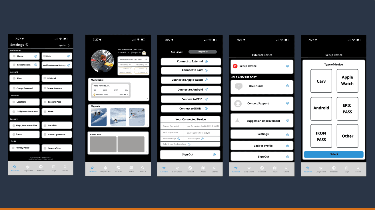
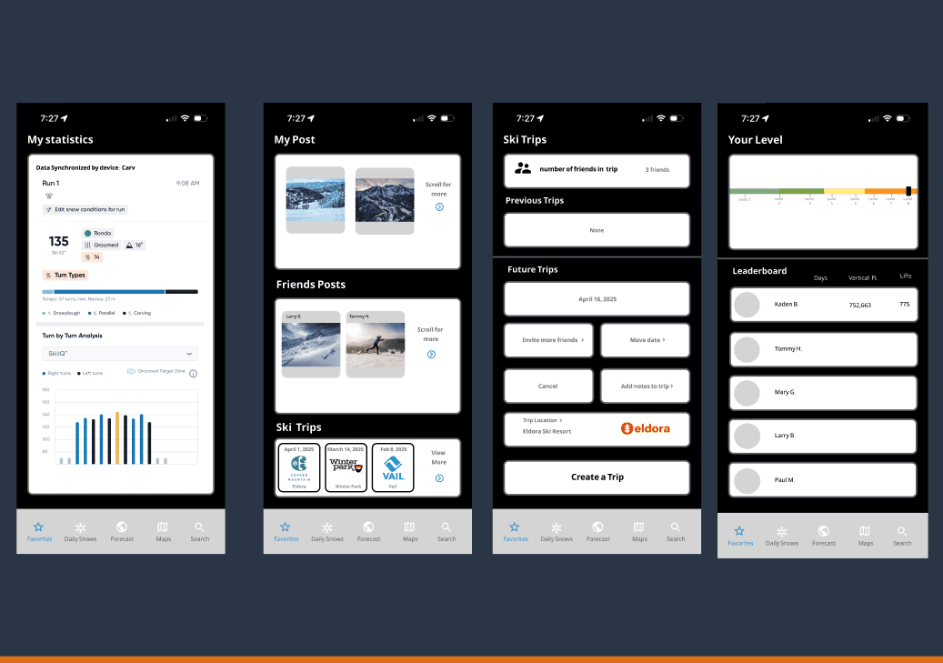
Progressive Disclosure: Show complexity gradually
Contextual Education: Teach features when relevant
Customizable Views: Weekend mode vs Expert mode
Discovery Pathways: Guide users to advanced tools
Final Solution - UX Impact & Results
Measurable Improvements:
Feature Discovery: Clear pathways to hidden tools
User Confidence: Educational moments reduce confusion
Support Reduction: Self-service learning decreases tickets
Retention: Users grow expertise within the app
Business Value: Higher engagement, lower support costs, improved user satisfaction
Key Learnings
What This Project Taught Me:
User Education > Simplification
Don't hide complexity—make it learnableIteration Reveals Truth
Each failed approach uncovered deeper user needsReal Client Constraints
Working with live product data provides authentic insightsFeature Discovery is Design
Great features fail if users can't find them
Want to see the Figma Presentation?
Click here and it will take you there!