Slyce Pizza Rebrand
When a neon sign became the blueprint for an entire brand transformation

Client
Type
Role
Year
The Overview
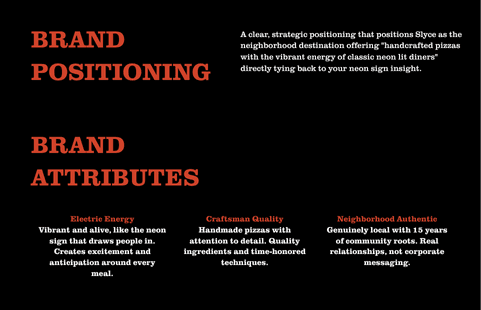
The brand needed rebranding and the idea came from a neon sign that was already established inside of the restaurant paving the way for the the entire brand rebrand with greater visability.
The Breakthrough Moment
Walking into Slyce Pizza, there it was this massive neon sign taking up the entire back wall. Glowing. Impossible to ignore. Visible from the street, especially at dusk when it practically calls out to every passerby. The question became: Why are we fighting this? This IS the brand.
The before and After
Before

After
Strategic Process
Reverse-engineering a brand system from their most powerful existing asset
Asset Discovery
Identified the neon sign as the strongest brand element which was visible from the street, it creates an atmosphere, drives foot traffic at peak dinner hours.
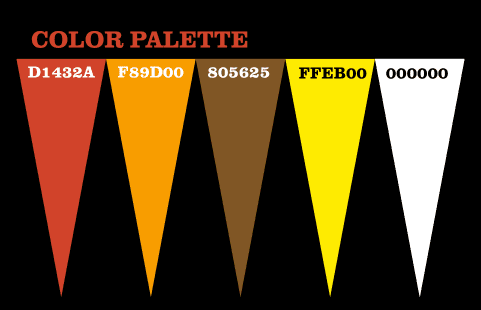
Color Preservation
Maintained the existing neon color palette to preserve brand equity while ensuring the colors performed across digital and print applications.
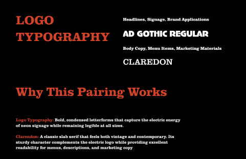
Typography Evolution
Refined typography to capture neon aesthetic while improving readability while maintaining the electric energy that makes the sign so compelling.
System Scalability
Created logo variations that work with and without neon affects ensuring brand consistency from store signage to the menu.